Sahə
Forma · sübut
Service
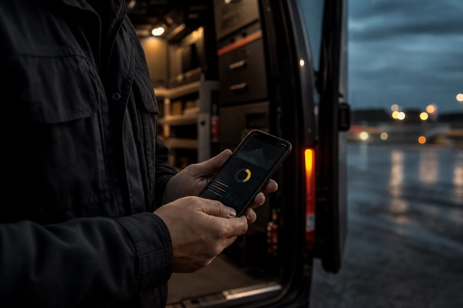
Carrying the same product on phone and browser. Not a separate random app — a cut experience that works in the field.
The customer or the team finishes the same work on the phone: login, operation, notification. It is not a “shrunken” desktop — it is thought for mobile.
Sahə · PWA · API
Sahə əməliyyatı
DEMO DATA
Toxunma · PWA · Sahə
Masaüstü kiçildilmir. Axın telefonda yazılır.
PWA siqnalları
quraşdır · keş
01 · ad · ikon · tema
Manifest
Hazır
02 · store yox
Install
Ev ekranı
03 · yavaş şəbəkə
Keş
Kritik axın
04 · bir qayda
API
Ortaq
Who it fits
Field and service teams
Updating status on the road, a photo or a signature — the phone is the main device.
Products open to the customer
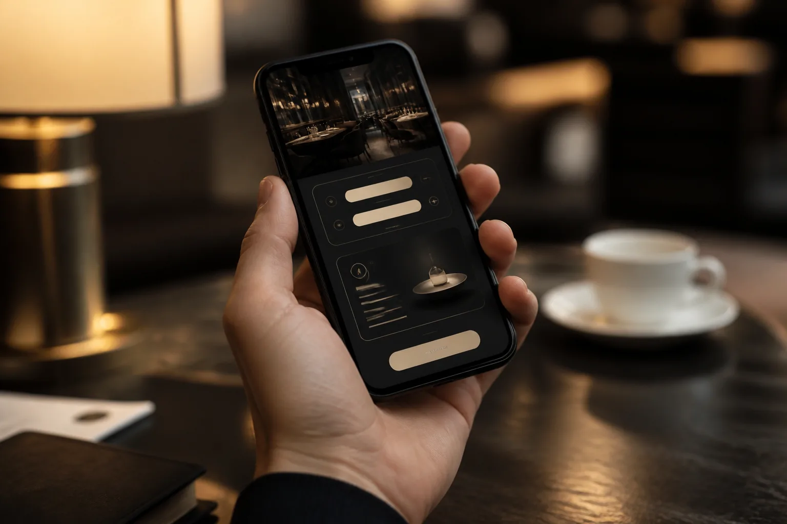
Account, order, booking — most traffic lands on mobile.
A start without a store
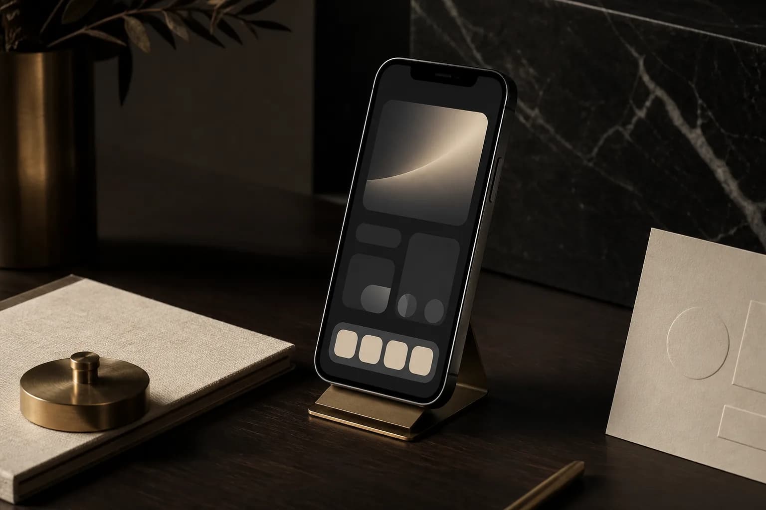
Those who want to prove value first with PWA / responsive, and evaluate native later.
Cihaz
Sahə, ev ekranı və müştəri axını eyni qaydaya bağlıdır. Kiçildilmiş desktop yox — hər səth öz işi üçün kəsilir.
Bir əllə status, foto, imza.
Sahə · Forma · sübut
Ev ekranı. Store yox.
PWA · Manifest · keş
Sifariş telefonda bitir.
Müştəri · Hesab · rezerv
Sahə
Forma · sübut
PWA
Manifest · keş
Müştəri
Hesab · rezerv
Use cases
A project does not need all of them. The cut is chosen for your need — then growing stays easy.

Responsive web application
Müştəri
Rezerv 18:30
2 nəfər
Sifariş #441
çatdırılma
Hesab
kart
Portal and panel comfortable on phone and tablet — the same URL.
PWA
PWA
Store yox. Manifest, ikon və keş — brauzerdən tətbiq hissi.
Home-screen icon, cache, and (where supported) push — without a store.
Field operations
Sahə
Fast form, camera/file, status update — close to one-hand use.
Mobile client + API
Ortaq backend
Request
Authorization: Bearer
X-Device: pwa
Response
{ "open": 3,
"sameRule": true }
Readiness for a future native or cross-platform layer over a shared backend.
Problem
A desktop-only flow breaks in the field and on the road. Shrunken desktop buttons do not fit the hand, the form is tiring, offline or a slow network is not considered. A separate native app can mean a store and double maintenance every time — expensive without the need.
Solution
Responsive web + a PWA foundation; a mobile client over a shared API when needed. The core: the same business rule, a flow that fits the phone. Result: an installable, fast experience bound to one backend.

Yolda da işləyir
Yavaş şəbəkə, bir əl, eyni qayda.
Outcome
01
A flow that finishes on the phone
Core tasks are completed without a large screen — button, form, and navigation fit.
02
Add to home screen
A shortcut and a more app-like feel with PWA — as needed.
03
The same API, the same rule
Mobile and desktop do not tell a different “truth” — one backend.
04
A smart native decision
Store and native only when there is a real need — proof first, then investment.
Sahə · status · eyni API, telefonda
Növbə
Foto, imza və status bir axında. Excel yox — telefon.
Sahə növbəsi
canlı · 3 açıq
Sahə
Process
01
Device and scenario
Who uses it, where, on which network — the core 3 flows are chosen.
02
Mobile flow
Not a desktop copy: navigation, priority, and forms are recut.
03
Build and device test
Check on real phones. PWA and performance are added carefully.
04
Delivery
Go-live, a short install guide, and an honest price of the native need.
Delivery
Difference
Not a shrunken desktop
Every screen has a mobile job. There is no “we will make it responsive later” approach.
A smart start with PWA
Many needs are covered without a store and two native teams — proof gets cheaper.
The same business rule
Mobile is not invented as a separate product; it is a field extension of the existing system.
A short conversation is enough. We clarify the need, draw the path, then make an offer.
Write now — no need to wait for the form.
Write on Instagram